Yellow = Joy & Warmth
The JPG is a little funky. The brush around the letters matches with the black scratches in the back.
Anxiety was a selected typeface with smudged brush strokes. The background is a close-up of my pizza pan, all cut up from the many pizzas it's served. I felt the sharp line work moving in the outward direction mixed with the distortion of the rust gave a nervous feeling. How does you feel?
This time, I used a photo of the inside of my oven, heavily filtered. Sadness is widely associated with grey while I felt that sadness was deeper than that, and had a very dark navy. The type was chosen to be small because I associate sadness with a quiet and alone feeling. The purposeful extra S crooked letters gave a sense of hopelessness and desperateness.
This is where I hit my first wall.
How can I represent anger in a way that isn't cliche? The obvious first step was to define what cliche was, by doing the cliche thing.
Blood and custom brushed digital type. Tacky, but you've gotta crack a few eggs...
In my second attempt, I realized that anxiety could also be read as anger, just as long as I changed the type. While I know it isn't good, it did offer some insight. A certain type of anger is loud, and that's the kind I want to represent. The obvious solution to representing volume was to go big, maybe even coming off of the edge. I stopped at this point and decided to revisit at a later point.
(BRAIN BLAST: Maybe this case should be hand made, created with dirt and collage of materials. Maybe cut type and place on top of destroyed paper. Sometimes the best way to represent an emotion through art is to feel that emotion during its creation.)
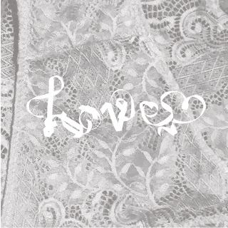
Love was fun. I collected materials for this, lace and ribbon to create the type in a script fashion without just using a script typeface. I knew that script was the best way to represent any romantic emotion through type, but I was inspired by the use of the pizza pan in the anxiety and anger vinyl cases. Here are some other examples, where I began exploring the different emotions felt with different color combinations. It was interesting to see how "love" feels a little more like "lust" when the colors become a little more red, or how the whites and light pink created an angelic emotion.
Quiet, if this were a playlist, I think I'd expect to hear Amy Winehouse.
A little more loving, higher tones. What'd be considered "girly".
Can you think of anyone you might hear on this playlist?
Still "girly" but feels a little more flirtatious and fun and not as stuck up as the one above.
WHAT IF: For the show, I displayed a piece of art such as on the one above and asked the audience to add songs to the playlist they think fits the emotion. It's a way to engage the audience, ask them to examine their music more deeply, receive information for my thesis, and share music.


No comments:
Post a Comment